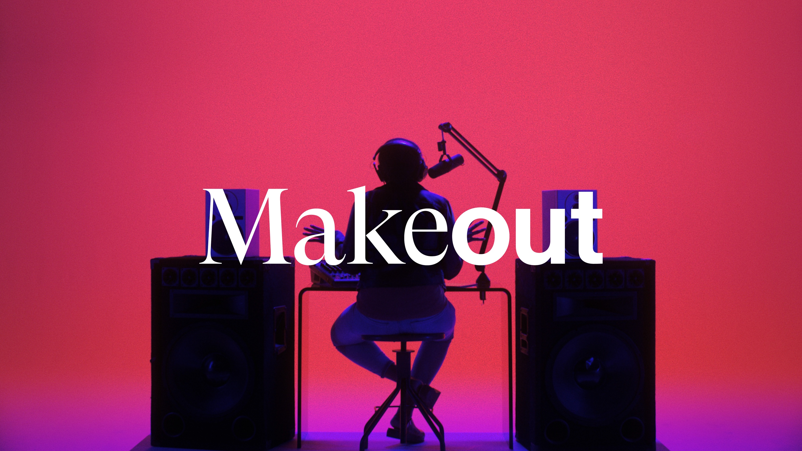
Makeout
Makeout is a rad production company and creative agency based in Brooklyn. When they came to us, they found themselves in a bit of a dilemma. They felt that their agency was split between two worlds: the “formal” side (working with some of the worlds biggest brands) and their “self-initiated” side (a DIY attitude and enthusiasm for self-produced projects).
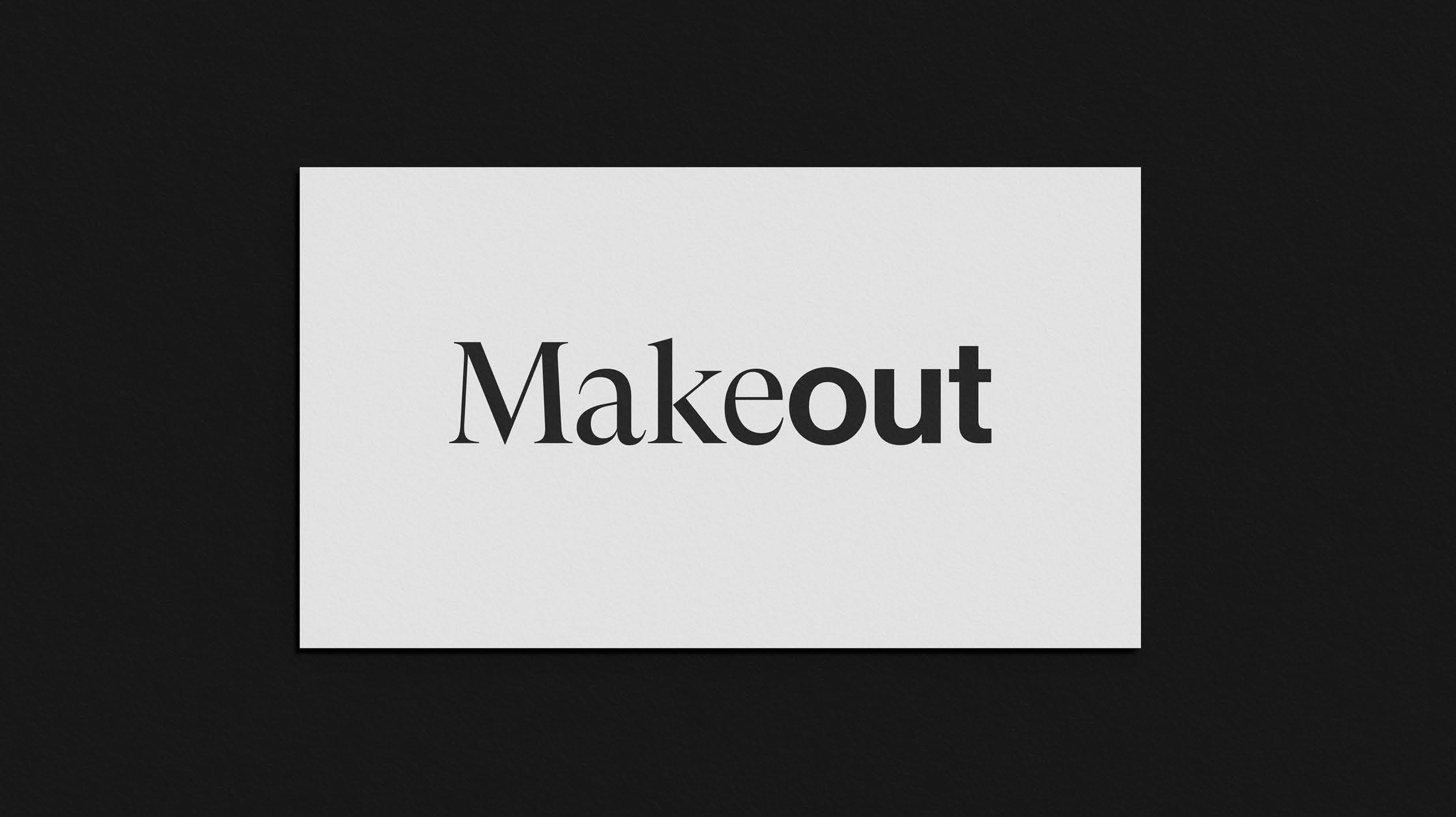
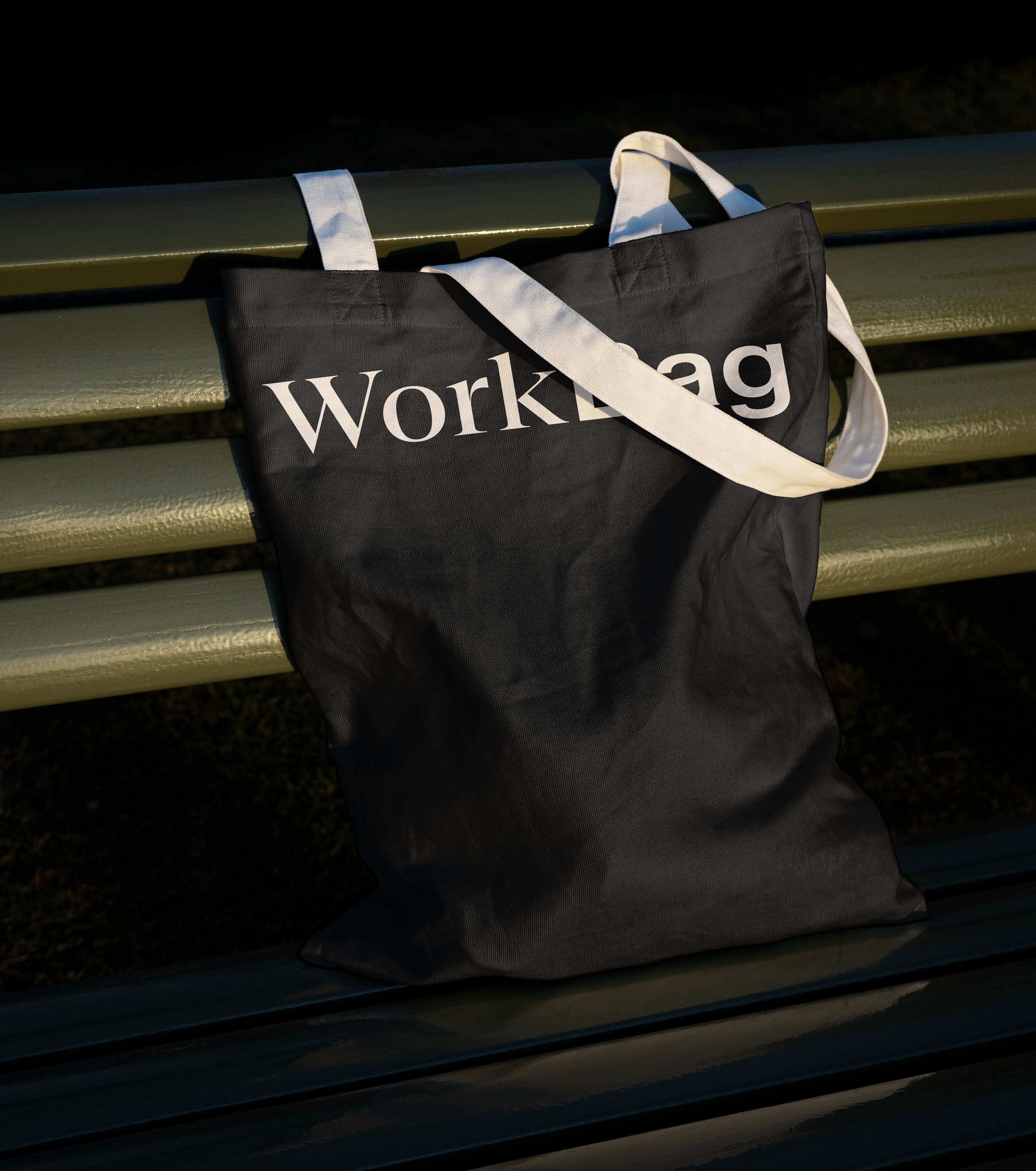
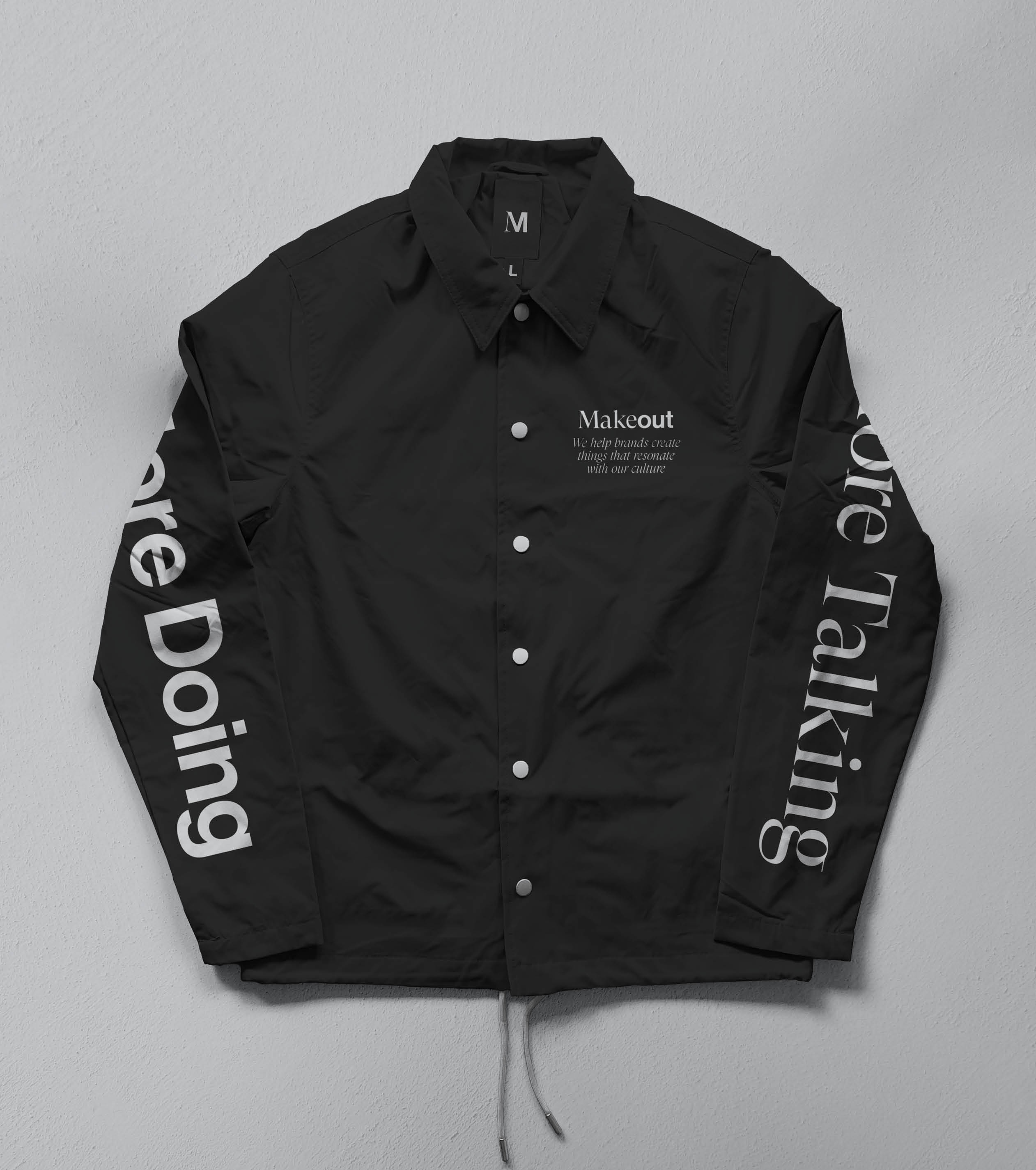
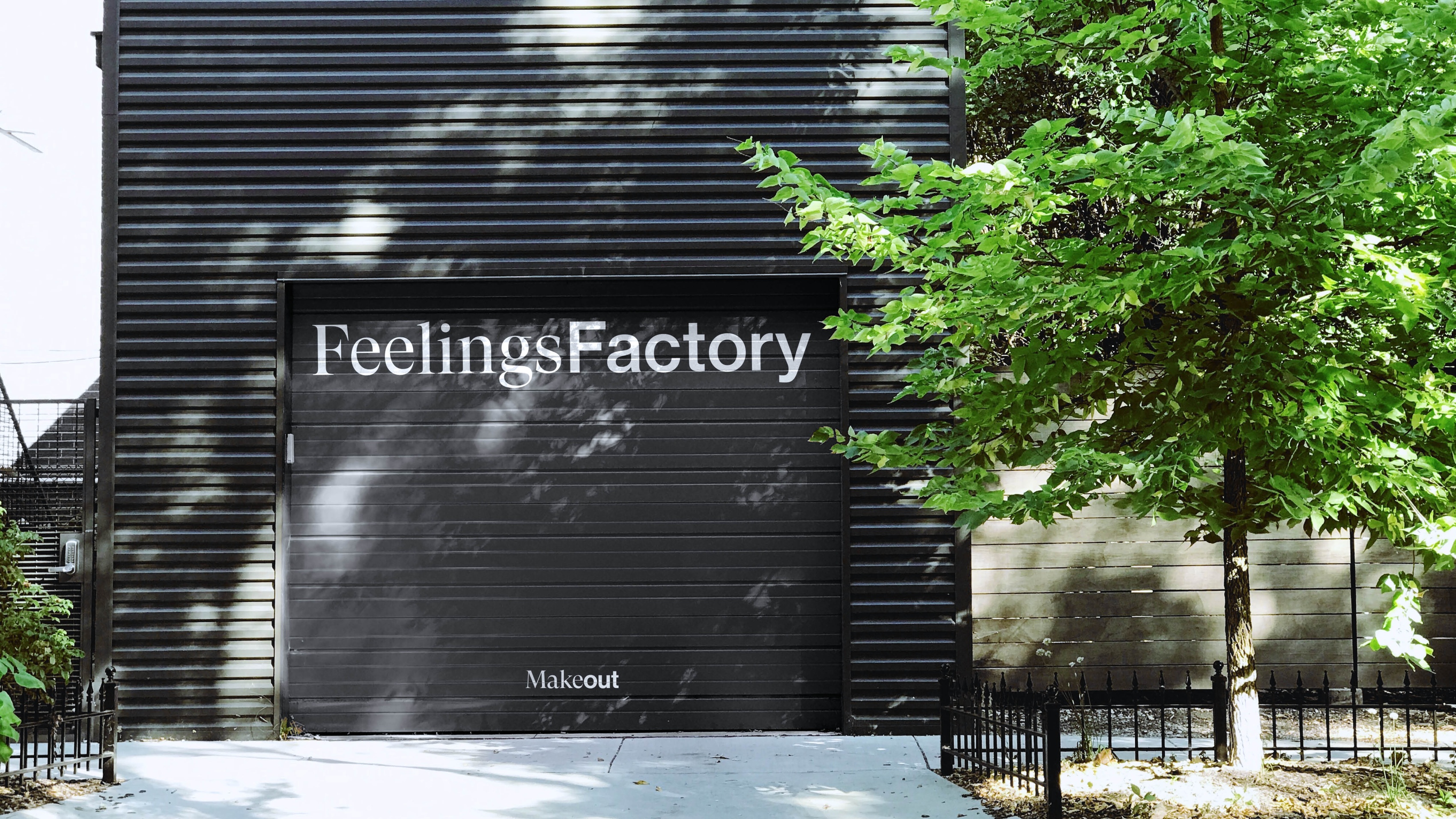
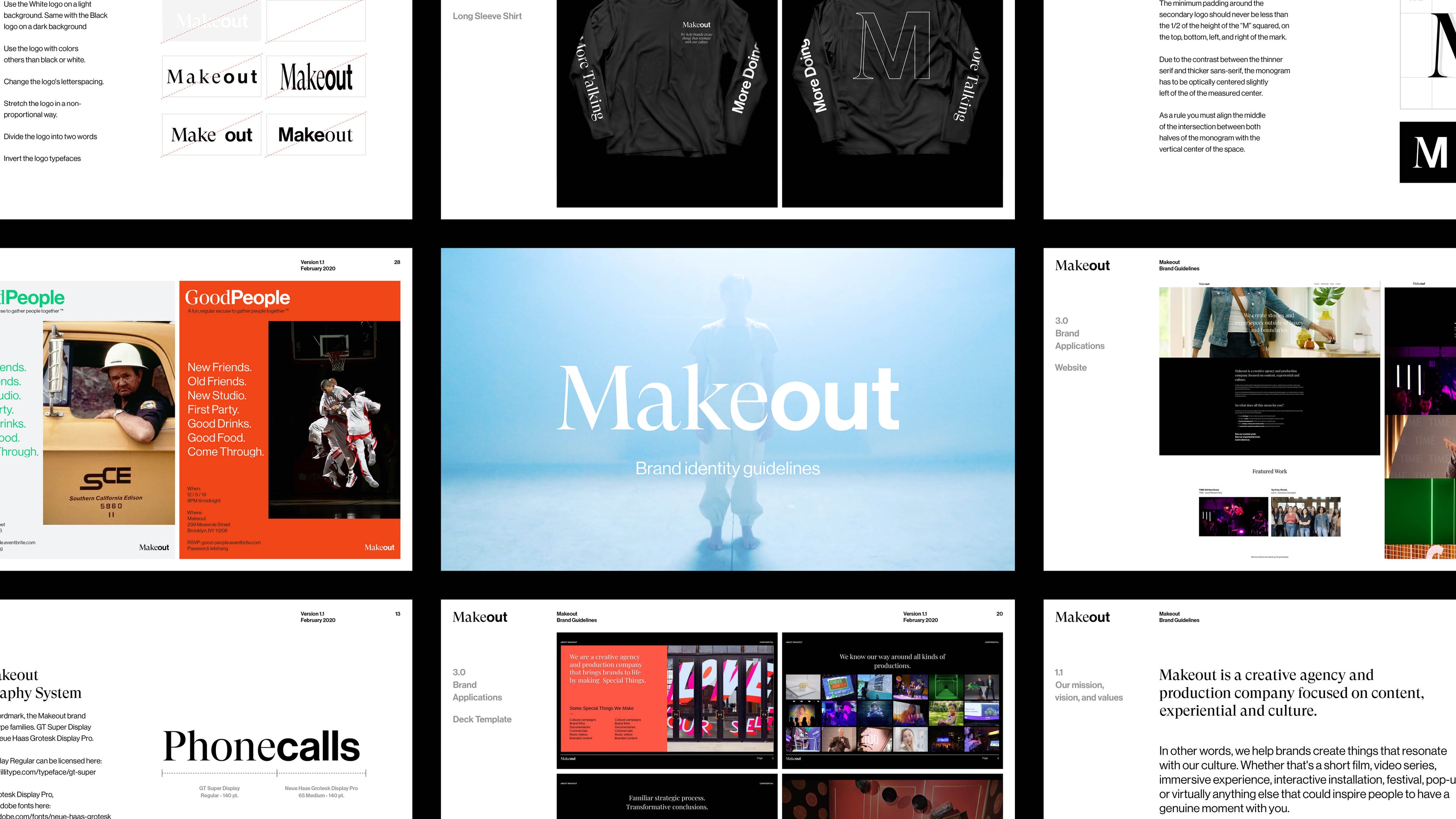
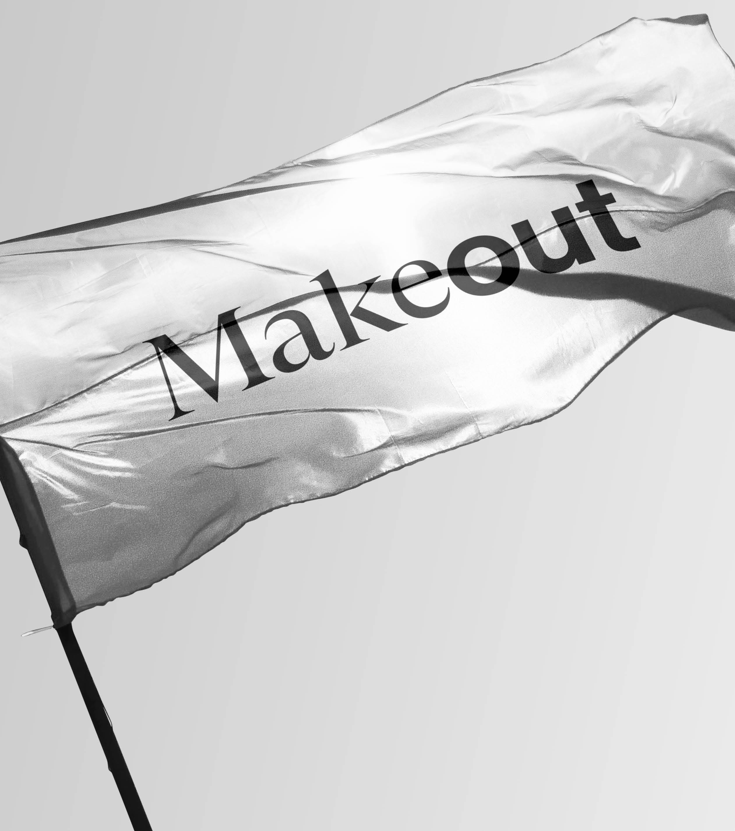
Someone needed to figure this out for them. Well, in we roll and used this dilemma as a starting point. We built them an identity system that embraces duality and makes it a core element of their brand. Leaning into this “two sides” concept, we created a wordmark that smashes together a traditional formal serif typeface and a casual and unassuming sans-serif.
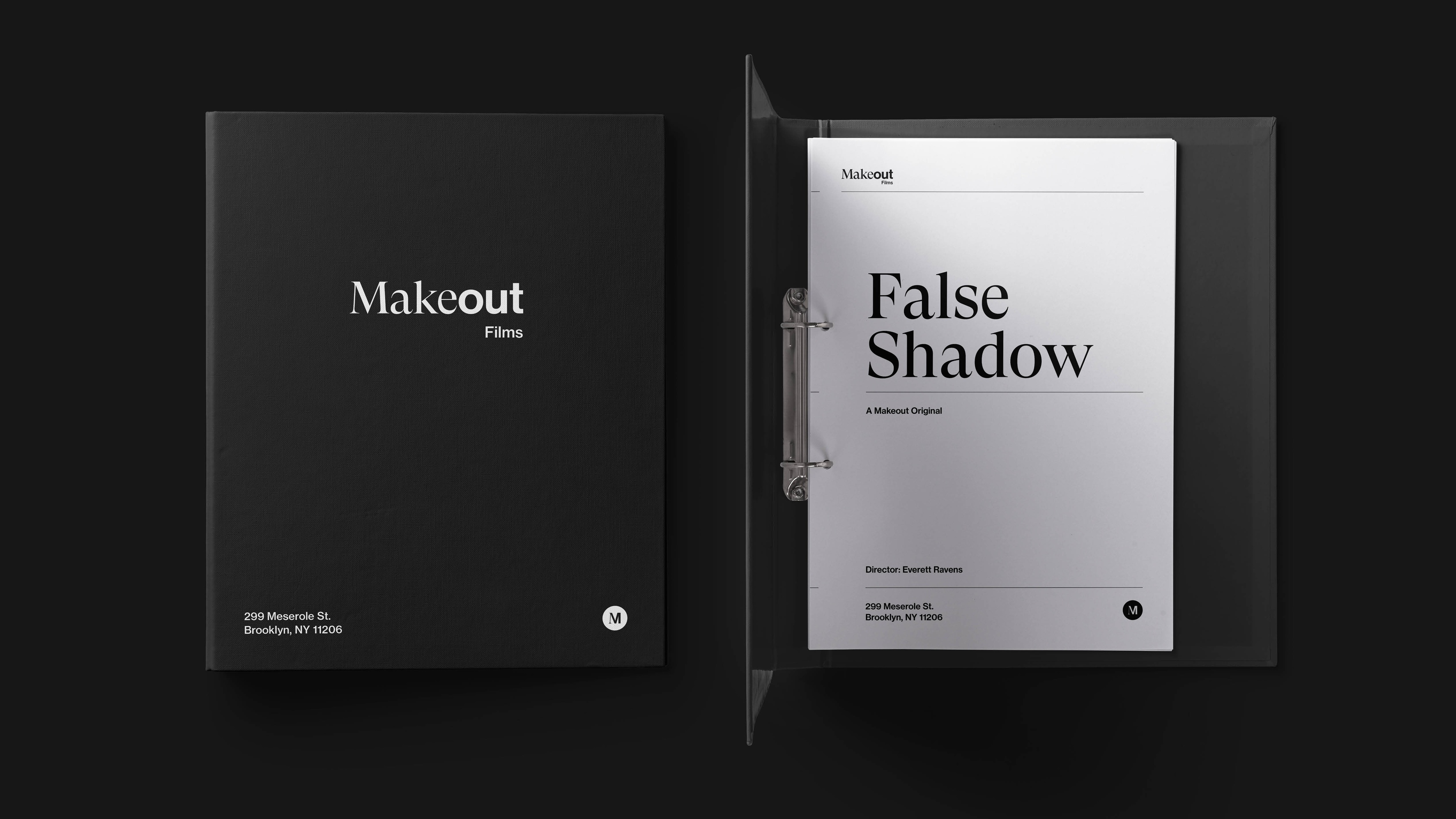
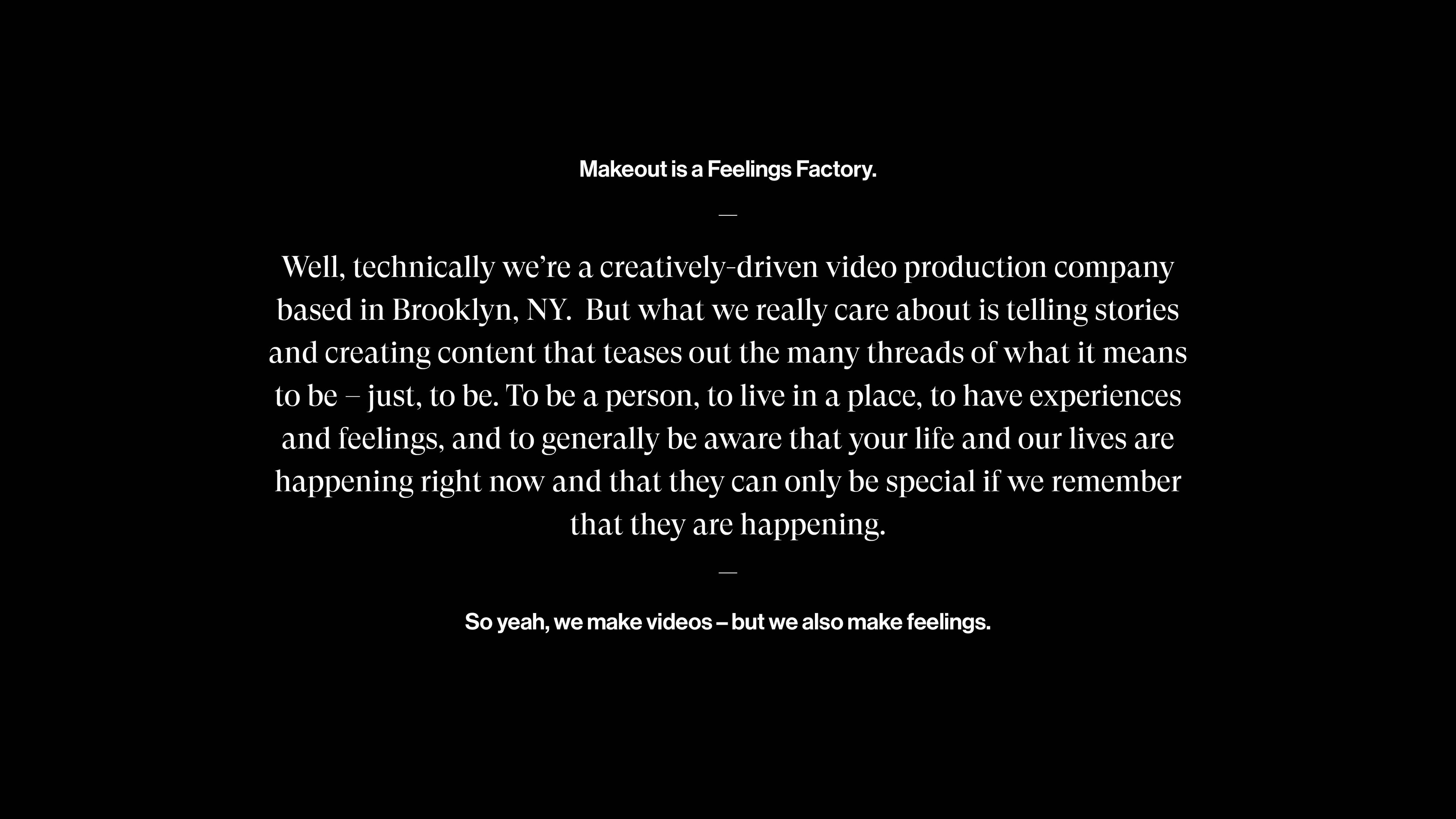
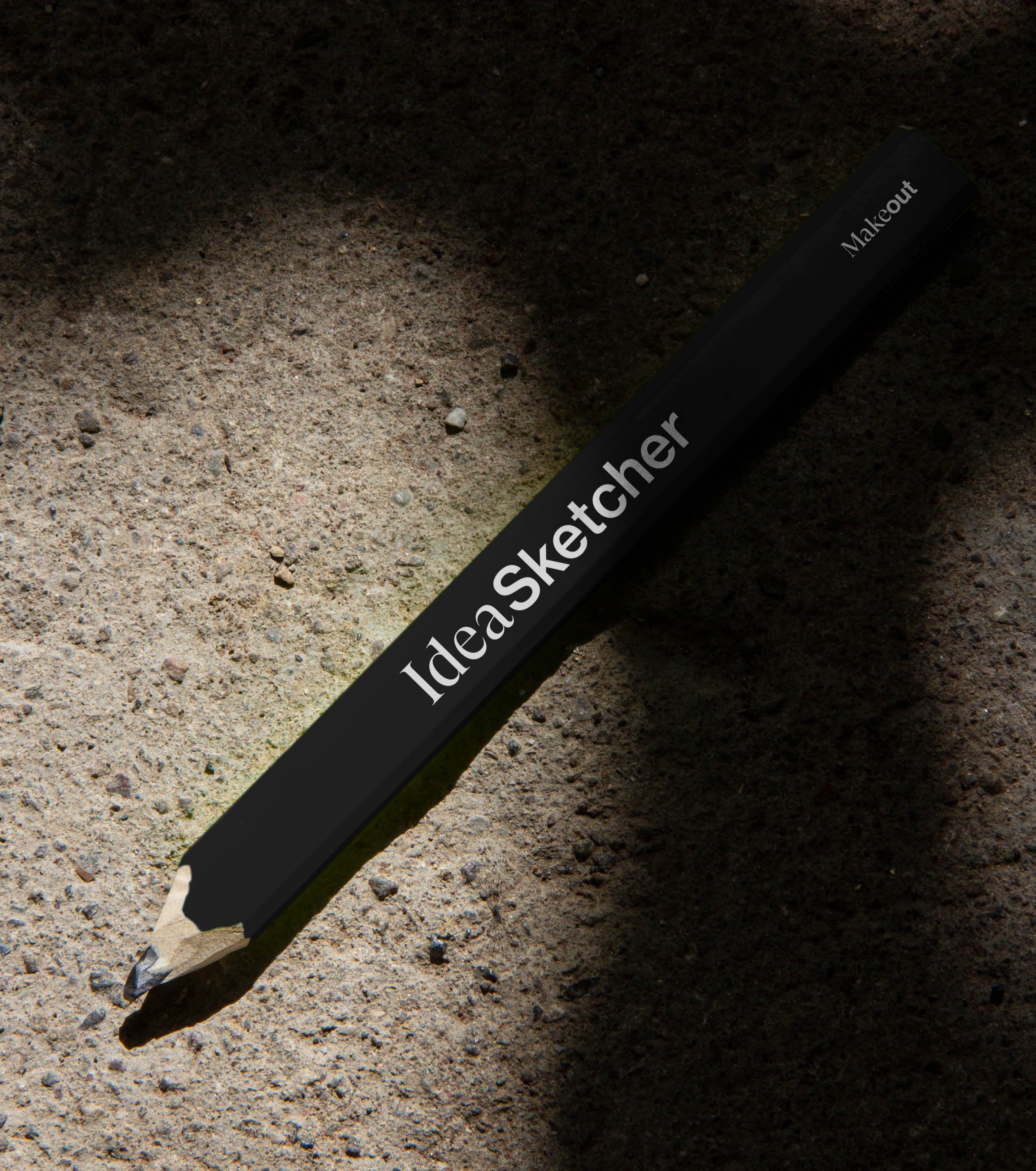
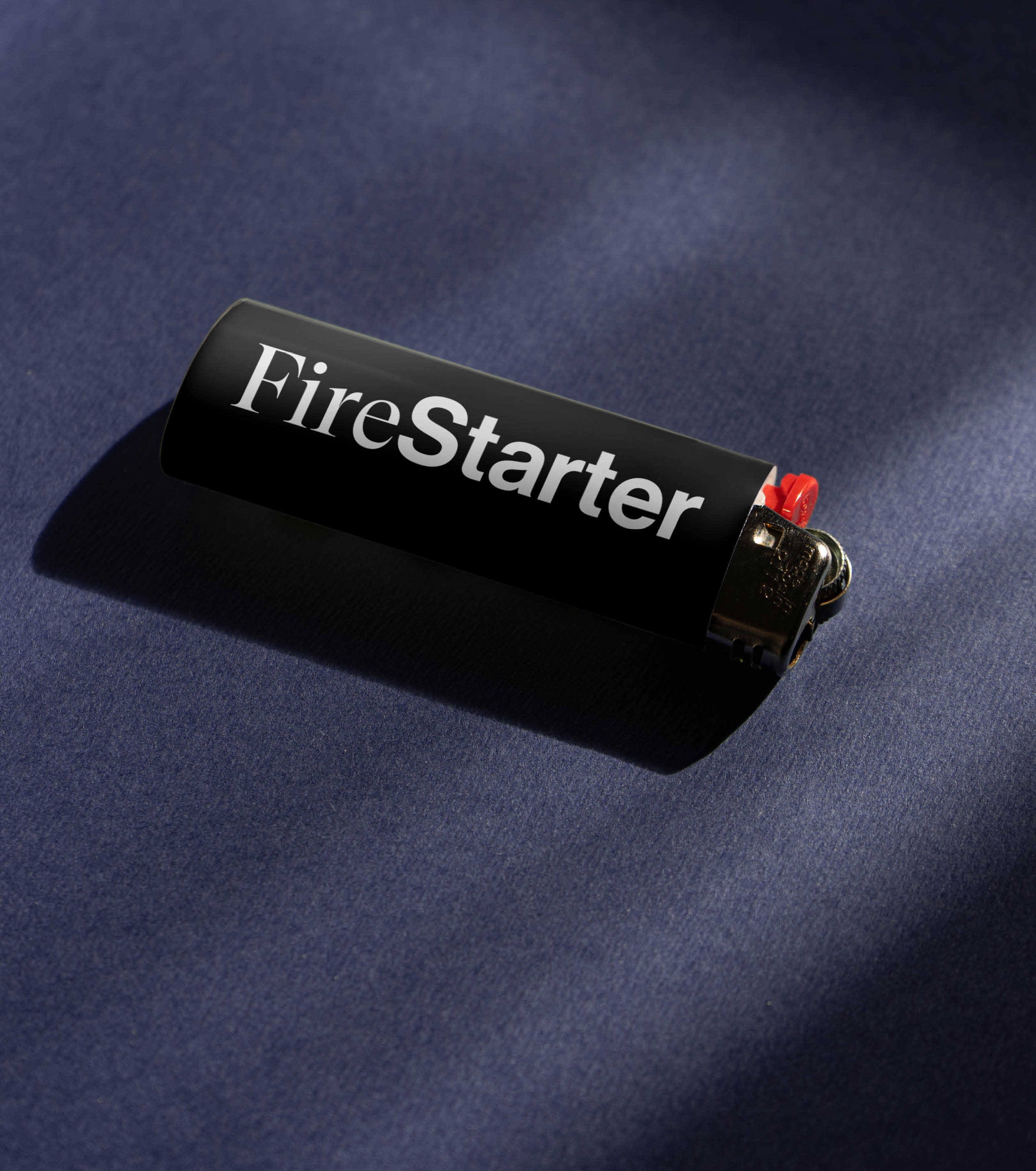
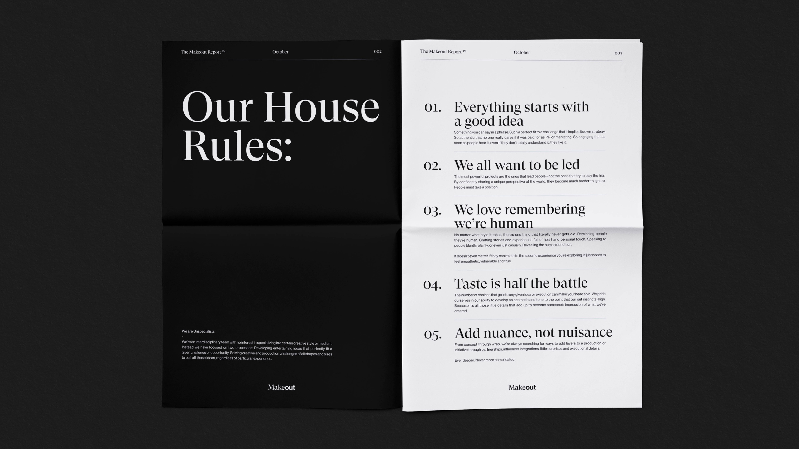
We carried this duality across all expressions of Makeout: pitch decks, apparel, swag and motion design. The result is a design system where both their corporate voice and DIY attitude can coexist–and each is made better because of the other.
Client
Makeout